|
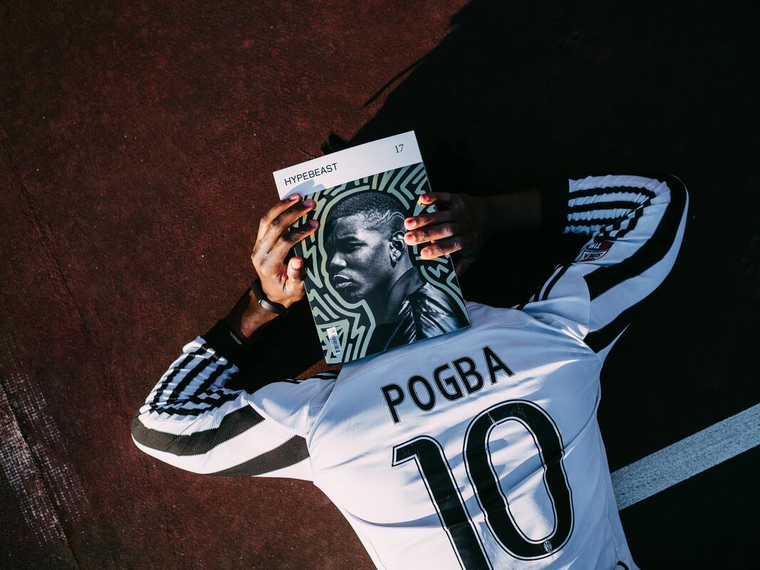
Athleisure has been gathering stride over the last five years. According to Marriam-Webster athleisure can be defined as, "casual clothing to be worn both for exercising and for general use." Think football jerseys, joggers, sneakers, t-shirts and hoodies. Brands like Yeezy, lululemon and Ivy Park made athleisure wear more popular. Classic fashion brands like Tommy Hilfiger launched its athleisure range, Tommy Sport in 2019, not wanting to miss out on the opportunity to win over more supporters. According to Grand View Research, the athleisure market was worth $348.95 billion in 2020 and is forecast to be valued at $517.48 billion by 2025. It's no wonder why football teams have been getting in on the act as well. Football clubs are opting for jersey designs that are made from techincal fabrics that can be worn on the pitch but won't look out of place if you were to wear them casusally as well. Retro jerseys tend to be a popular part of the athleisure scene due to their rarity and interesting designs. Football teams are trying to make their jerseys more stylish so they can try and compete in the athleisure market. Jerseys can be paired with a pair of slim fit jeans and a bomber jacket. The Premier League starts today and I've rated every Premier League clubs home and away jerseys - from the Good, the Bad and the Fugly.
Arsenal
Arsenal's home jersey is a throwback to the good ol'days when they used to win leagues (remember that?) as it incoprporates navy into the Adidas stripes on the shoulders, around the collar and on the tip of the sleeves. It's mainly red with white sleeves which is nothing new there for an Arsenal jersey. The collar's shape is a bit different but in a good way. Overall it's a tasteful jersey. At least they will look good losing.
Rating: Good
The away jersey is another nod to the past, paying homage to the double winning side of 1971 and the league winners of the 1989. I like the simplicity of the cannon and the navy looks well on the yellow. However, the yellow is a bit too washed out for me and I would have preffered a shade that's a bit darker. The red rim on the sleeves shows nice attention to detail. The jersey would look best on sallow skintones as that shade of yellow will make fair skin look washed out.
Rating: Good Aston Villa
It's very similar to last season's jersey, apart from the stripes. It would be nice to see blue being incorporated more into future jerseys or maybe some yellow.
Rating: Bad
Nice, clean design. The claret pinstripes add more class to the jersey, along with subtle horizontal double stripes. The claret and sky blue tips on the sleeves finish it off well. Front runner for one of the best away kits so far.
Rating: Good Brentford
White jersey and red awning stripes. It's a bit boring.
Rating: Bad
Nice shade of yellow, with black hoops on the sleeves. Very fitting for the bees. I do love a v-neck collar as well and the black adds a nice contrast to it.
Rating: Good Brighton
Brighton and Hove Albion are going with its tried and tested blue and white balanced stripes again. The gold Nike tick and yellow stripes going up the side add a nice pop of colour. However, nothing ground breaking.
Rating: Bad
A mint green away jersey with a weird design on the sleeves is just a bit much. Mint is okay if there's a pop of it but I'm not a fan of a whole jersey in mint.
Rating: Fugly Burnley
The subtle claret, complements itself well with blue sleeves with a mixture of stripes.
Rating: Good Chelsea
Chelsea are defintely going for the athleisure look with this home jersey. Problem is that it's an eye sore. The mixture of chevron stripes (zigzags) and checks hasn't grown on me and I don't think it will anytime soon. Horrendous.
Rating: Fugly
The jersey is a nice shade of yellow, featuring black, horizontal pinstripes. The faint vertical pinstripes add a nice bit of detail. The black tips on the sleeves and black at the back of the collar finish it off. I don't like the black horizontal pinstripes with the yellow as it looks a bit tacky.
Rating: Bad Crystal Palace
Crystal Palace have gone for something slightly different this season with horizontal stripes in a regimental style. I like the use of the two different shades of blue, giving the jeresy more personality. The blue tips on the red sleeves and blue collar are simple but classic.
Rating: Good
The away kit is a bit meh. The yellow with red and blue stripes on the left shoulder make it an okay kit.
Rating: Good Everton
The deconstructed stripes on the torso add something different to this season's Everton jersey. The Hummel arrows on the sleeves and the design on the torso give the jersey a bit of a retro feel.
Rating: Good
The red stripe going across the chest ruins what could have been a nice and simple jersey.
Rating: Bad Leeds United
Leeds like a few other clubs are trying to go for a retro feel with a grandad collar. I would have liked to have seen a bit more effort going into the design but it's still a nice jersey.
Rating: Good
The royal blue, paired with white Adidas stripes, white crest and sponsor make the jersey clean and classy. Leeds have opted for a no-fuss crew neck collar, putting more of the focus on the colour and the jersey's pattern.
Rating: Good Leicester City
The design itself is nice. I like the gold tips on the collar and sleeves. I don't like the pattern though because the baby blue makes the pattern too prominent.
Rating: Bad
I already mentioned my dislike for all mint kits. Adding a giant houndstooth pattern to it makes this jersey a shocker. The designers were trying to be too different here, which has resulted in a terrible jersey.
Rating: Fugly Liverpool
The deconstructed diagnol stripes work well with the red and aren't something you see everyday. The green and white at the back of the collar are a nice touch too. However, orange stripes on the collar and at the end of the sleeves. Orange. On a a red jersey. No.
Rating: Bad
The dark green, 'stone white' and crimson red away jersey is bringing the fans back to the club's roots as it's a nod to the away jeresey from the 1996/97 season. The minimilastic design make the jersey look effortlessly stylish.
Rating: Good Man City
The jeresy pays tribute to the 10th anniversay of the title win from 2011/12. It has '93:20' on the back of the collar which was the time in the match Agüero scored to make Manchester City league champions. The jersey has a scoreboard pattern all over it which makes it quite eye-catching. It has white panels under the arms which is a nice contrast from the sky blue. The collar looks like it's slightly too low but each to their own.
Rating: Good
The different shades of blues on the Manchester City away jersey is meant to represent water. The pink complements the other colours well, making City's away jersey a real winner.
Rating: Good Man United
United are trying to go for a retro look with their new home kit. It's nice and has very subtle dark red, bold stripes spaced out on the torso, adding a bit more detail to the jersey.
Result: Good
According to Adidas the jersey is, 'cloud white' and 'glory blue'. It's a tribute to the jersey of the 1991-93 season. The geometric blue design with the club crest, Adidas stripes and sponsor logos all in 'solar red'. United have been trying hard the past few years to make a jersey that can blend in as athleisure and I think they have finally got it.
Rating: Good Newcastle United
One expects to see black and white stripes on the Magpie's home jersey. These stripes look thicker than usual and along with the grandad collar give the jersey a real classic feel. The sponsor logo looks tacky though. But the good outweighs the bad here.
Rating: Good
Too much going on here. I feel sick looking at it.
Rating: Fugly Norwich City
Same colourway used as normal. The design on the sleeves is interesting and just about saves it.
Rating: Good
The design is just the same as the home jersey but the colours are reversed. I like the colourway of black with a pop of mint. Take note Leicister City and Brighton on how to use mint on jerseys. The black hairline stripes on the black jersey adds a nice level of detail.
Rating: Good Southampton
The grey arrows on the white stripes give the jersey a bit of integrity. Due to the collar being a different colour to the main part of the jersey it stands out. However, I think the bottom of it is too thick and draws too much attention to it. The sponsor looks tacky as well. The collar and sponsor logo ruins what could've been a nice jersey.
Rating: Bad
The collar is in the same style as the home jersey. However, it's the same colour of the sleeves and blends in well. The yellow works well with the blue and the sponsor's logo blends in better with this colourway. The design at the end of the shirt is needless but isn't too noticeable.
Rating: Good Tottenham
Clean design and nice detail with the stripes.
Rating: Good
Absolute abomination. Designs can be different without being tacky. The Spurs logo and sponor logos are in bright green which adds insult to injury. The designers should have used a colour that is less in your face so that there's more of a balance with the other colours.
Rating: Fugly Watford
The stripes on Watford's home jersey give it a proper eigthies feel and works well with the yellow.
Rating: Good
Nice use of the club's colours and the panelling underneath the arms look well.
Rating: Good West Ham
I think the collar looks out of place on this jersey and doesn't do anything for it. However, the rest of the jersey is nice.
Rating: Good
The baby blue stripes look well on the white and the pop of claret on the collar and arms adds a touch of class.
Rating: Good Wolves
The black around the collar looks great as it emphasises the neckline of the jersey. The black on and under the arms makes the jersey more interesting, along with the white stripe.
Rating: Good
The splashes of orange and grey are reminisent of 80's and 90's jerseys and the design really works. Take note Spurs on how to splash colour on a jersey.
Rating: Good ​Many clubs are going for a retro look as it's popular now as they are seen as more fashionable. It pains me to say this as a Gooner but the best jersey of the season would have to be Man United's away jersey. It's very slick and I can see it becoming very popular. The worst jersey is the Spurs away jersey which is Fugly. No other words for it. Only time will tell if any of this season's jerseys will become a part of the athleisure phenomenon. Comments are closed.
|
 RSS Feed
